Personal Work
Paintings
Gift Art
Tutorials
RPG work
Darkness Rising
Card Game Art
Final
Twilight
Bio/ Resume
Comissions
Links
Contact
|
Tutorial 1- Raisabet (Sorceress 4)
----------------------------------
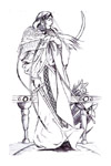
This was a piece where I wanted to
borrow some elements from Alphonse Mucha into the piece. These elements
are far more obvious in the initial ink drawing than in the final
piece, but that's exactly what I was after-an improvement in my work,
not just an apeing of Mucha.
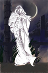
Raisabet is the head of the
Sorceress Academy near Falconreach in the world I have in my head. This
is the fourth of my sorceress paintings.
I don't always start with a
drawing this detailed. Since I was working with Mucha reference though,
I decided to work as much of the figure out ahead of time in an inked
drawing.
|
|
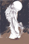
So I
bring the scanned inked drawing into Painter. I almost always start a
painting in Painter anymore, and in this case practiaclly finish it
there as well. I still use Photoshop for occasional layer management
and a little bit of soft light, but that's basically it for PS.
Just like in traditional
painting I try to work back to front, setting down the environment
before adding props or rendering the main figure. I start with
duplicating the inked layer and setting the mode to gel (like multiply,
but softer). I then start throwing color behind the line art very
loosely to get a feel for the color balance.
|
|
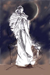
Step 2- Smudga Smudga
taking a moderately wide blender brush, I work over the gloommed on paint from step 1.
I work in small strokes so the individual color patches are still there but the edge smooth out. I realize I need some more saturation in the bluesso i work it a third color with more sat at this point.
|
|
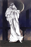
Step 3- Props Department
once I have the sky starting to really take shape and clean up the cresent of the moon, I start blocking in the background and midground elements. This serves to give me a little better idea of the kind of tonal ranges I'll have running through the piece.
|
|
Step 4- bring into focus
at this point I start to render in the sky and background elements so they start to look good. I'm keeping saturations down, mostly concentrating on light and shadow.
|
|
All work copyright 2004 Thom Scott. Do not use without permission.
|
|

